@arcgis/core
Version:
ArcGIS Maps SDK for JavaScript: A complete 2D and 3D mapping and data visualization API
103 lines (101 loc) • 3.73 kB
TypeScript
import type Accessor from "../../core/Accessor.js";
import type ColumnMenuVisibleElements from "./ColumnMenuVisibleElements.js";
import type TableMenuVisibleElements from "./TableMenuVisibleElements.js";
import type { ColumnMenuVisibleElementsProperties } from "./ColumnMenuVisibleElements.js";
import type { TableMenuVisibleElementsProperties } from "./TableMenuVisibleElements.js";
/** @since 5.0 */
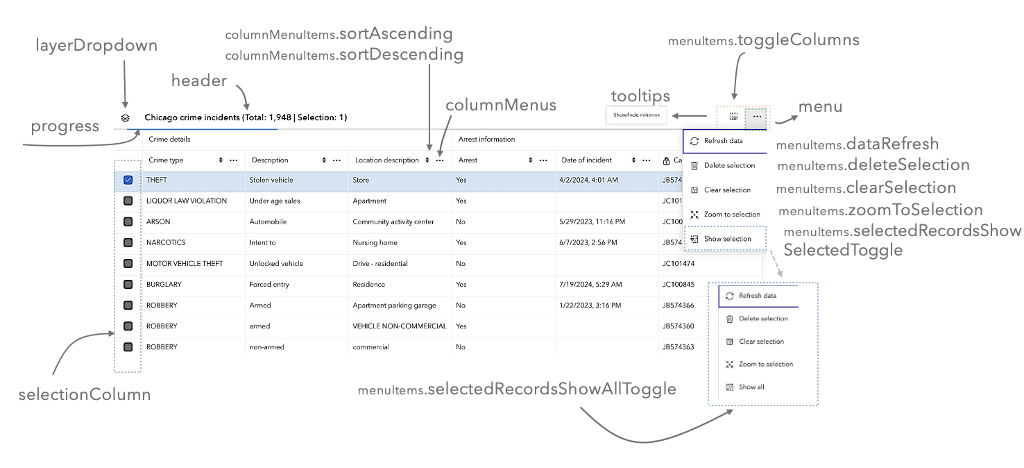
export interface VisibleElementsProperties extends Partial<Pick<VisibleElements, "columnDescriptions" | "columnMenus" | "header" | "layerDropdown" | "layerDropdownIcons" | "menu" | "pendingEditsFooter" | "progress" | "selectionColumn" | "tooltips">> {
/** The menu items within the column menu. */
columnMenuItems?: ColumnMenuVisibleElementsProperties;
/**
* The menu items within the feature table menu.
*
* @since 5.0
*/
menuItems?: TableMenuVisibleElementsProperties;
}
/**
* The visible elements that are displayed within the widget.
* This provides the ability to turn individual elements of the widget's display on/off.
*
* 
*
* @since 5.0
*/
export default class VisibleElements extends Accessor {
constructor(properties?: VisibleElementsProperties);
/**
* Indicates whether to display descriptions in the header cells of individual columns. Default value is `true`.
*
* @default true
*/
accessor columnDescriptions: boolean;
/** The menu items within the column menu. */
get columnMenuItems(): ColumnMenuVisibleElements;
set columnMenuItems(value: ColumnMenuVisibleElementsProperties);
/**
* Indicates whether to display interactive menus in the header cells of individual columns. Default value is `true`.
*
* @default true
*/
accessor columnMenus: boolean;
/**
* Indicates whether to display the feature table's header information. Default value is `true`.
*
* @default true
* @since 5.0
*/
accessor header: boolean;
/**
* Indicates whether to display the feature table's layer switch drop down menu. Default value is `false`.
*
* @default false
*/
accessor layerDropdown: boolean;
/**
* Indicates whether to display layer-specific icons in the layer drop down menu. Default value is `true`.
*
* @default true
*/
accessor layerDropdownIcons: boolean;
/**
* Indicates whether to display the feature table's menu. Default value is `true`.
*
* @default true
* @since 5.0
*/
accessor menu: boolean;
/**
* The menu items within the feature table menu.
*
* @since 5.0
*/
get menuItems(): TableMenuVisibleElements;
set menuItems(value: TableMenuVisibleElementsProperties);
/**
* Indicates whether to display the footer element while edits are pending. Default value is true.
*
* @default true
* @since 5.0
*/
accessor pendingEditsFooter: boolean;
/**
* Indicates whether to display the progress indicator when the table is querying or syncing data. Default value is `true`.
*
* @default true
*/
accessor progress: boolean;
/**
* Indicates whether to display the selection column in the table. Each row has a checkbox that selects its corresponding feature. Default value is `true`. If working with a map, make certain to set the `FeatureTable.view` property as this enables highlighting the corresponding feature.
*
* @default true
* @since 5.0
*/
accessor selectionColumn: boolean;
/**
* Indicates whether to display the tooltip for the Show/hide columns button. Default value is `true`.
*
* @default true
*/
accessor tooltips: boolean;
}