@arcgis/core
Version:
ArcGIS Maps SDK for JavaScript: A complete 2D and 3D mapping and data visualization API
154 lines (151 loc) • 8.35 kB
TypeScript
import type Color from "../../Color.js";
import type MapView from "../../views/MapView.js";
import type SnappingOptions from "../../views/interactive/snapping/SnappingOptions.js";
import type Widget from "../Widget.js";
import type GridControlsViewModel from "./GridControls/GridControlsViewModel.js";
import type VisibleElements from "./GridControls/VisibleElements.js";
import type { Icon } from "@esri/calcite-components/components/calcite-icon";
import type { WidgetProperties } from "../Widget.js";
import type { ColorLike } from "../../Color.js";
import type { SnappingOptionsProperties } from "../../views/interactive/snapping/SnappingOptions.js";
import type { GridControlsViewModelProperties } from "./GridControls/GridControlsViewModel.js";
import type { VisibleElementsProperties } from "./GridControls/VisibleElements.js";
export interface GridControlsProperties extends WidgetProperties, Partial<Pick<GridControls, "theme" | "view">> {
/** The custom color used for drawing the grid, if any. */
customColor?: ColorLike | null;
/**
* Icon which represents the widget. It is typically used when the widget is controlled by another
* one (e.g. in the Expand widget).
*
* @default "grid-unit"
* @see [Calcite Icon Search](https://developers.arcgis.com/calcite-design-system/icons/)
* @since 4.27
* @see [Calcite Icon Search](https://developers.arcgis.com/calcite-design-system/icons/)
*/
icon?: Icon["icon"] | null;
/**
* The widget's default label.
*
* @since 4.11
*/
label?: string | null;
/**
* The [SnappingOptions](https://developers.arcgis.com/javascript/latest/references/core/views/interactive/snapping/SnappingOptions/) that will be controlled by this
* widget if the snapping toggle is enabled for display by [visibleElements](https://developers.arcgis.com/javascript/latest/references/core/widgets/support/GridControls/#visibleElements).
* If SnappingOptions are provided, grid display will be automatically enabled or disabled to match snapping state.
*/
snappingOptions?: SnappingOptionsProperties | null;
/**
* The view model for this widget. This is a class that contains all the logic
* (properties and methods) that controls this widget's behavior. See the
* [GridControlsViewModel](https://developers.arcgis.com/javascript/latest/references/core/widgets/support/GridControls/GridControlsViewModel/) class to access
* all properties and methods on the widget.
*/
viewModel?: GridControlsViewModelProperties;
/**
* The visible elements that are displayed within the widget.
* This property provides the ability to turn individual elements of the widget's display on/off.
*
* @example
* gridControls.visibleElements = {
* rotateWithMapToggle: false,
* colorSelection: false,
* };
*/
visibleElements?: VisibleElementsProperties;
}
export type GridControlsTheme = "light" | "dark" | "custom";
/**
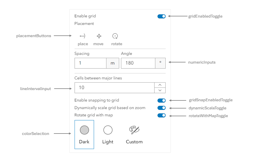
* `GridControls` provides a user interface (UI) for configuring and displaying a two-dimensional grid. The grid displayed provides a network of horizontal and vertical lines used to divide the view into equal cells. With support for snapping, the grid lines can be used as a reference when drawing features. Whether one is drawing features with [Sketch](https://developers.arcgis.com/javascript/latest/references/core/widgets/Sketch/) or [Editor](https://developers.arcgis.com/javascript/latest/references/core/widgets/Editor/), `GridControls` will be available with these widgets by default in the settings menus.
* The `GridControls` can be configured using the [visibleElements](https://developers.arcgis.com/javascript/latest/references/core/widgets/support/GridControls/#visibleElements) below.
*
* 
*
* > [!CAUTION]
* >
* > **Known limitations**
* >
* > - GridControls is only supported in 2D [MapViews](https://developers.arcgis.com/javascript/latest/references/core/views/MapView/).
* > - The grid spacing does not correspond to real world measurements. Distortion will be minimized when used in conjunction with an equal area basemap.
* > - The grid spacing input will be hidden when working with Web Mercator and Geographic Coordinate Systems.
*
* @deprecated since version 4.33. Use the [Grid Controls component](https://developers.arcgis.com/javascript/latest/references/map-components/components/arcgis-grid-controls/) instead. For information on widget deprecation, read about [Esri's move to web components](https://developers.arcgis.com/javascript/latest/components-transition-plan/).
* @since 4.31
* @see [Sample - Sketch temporary geometries](https://developers.arcgis.com/javascript/latest/sample-code/sketch-geometries/)
* @see [Sample - Edit features with the Editor widget](https://developers.arcgis.com/javascript/latest/sample-code/widgets-editor-basic/)
* @example
* // Initialize GridControls
* const gridControls = new GridControls({
* view,
* });
*
* // Add GridControls to the view
* view.ui.add(gridControls, "top-left");
*/
export default class GridControls extends Widget<GridControlsProperties> {
/**
* @example
* // Initialize GridControls. This will allow you to show a 2D grid and customize its properties.
* const gridControls = new GridControls({
* view: view
* });
*/
constructor(properties?: GridControlsProperties);
/** The custom color used for drawing the grid, if any. */
get customColor(): Color | null | undefined;
set customColor(value: ColorLike | null | undefined);
/**
* Icon which represents the widget. It is typically used when the widget is controlled by another
* one (e.g. in the Expand widget).
*
* @default "grid-unit"
* @see [Calcite Icon Search](https://developers.arcgis.com/calcite-design-system/icons/)
* @since 4.27
* @see [Calcite Icon Search](https://developers.arcgis.com/calcite-design-system/icons/)
*/
get icon(): Icon["icon"];
set icon(value: Icon["icon"] | null | undefined);
/**
* The widget's default label.
*
* @since 4.11
*/
get label(): string;
set label(value: string | null | undefined);
/**
* The [SnappingOptions](https://developers.arcgis.com/javascript/latest/references/core/views/interactive/snapping/SnappingOptions/) that will be controlled by this
* widget if the snapping toggle is enabled for display by [visibleElements](https://developers.arcgis.com/javascript/latest/references/core/widgets/support/GridControls/#visibleElements).
* If SnappingOptions are provided, grid display will be automatically enabled or disabled to match snapping state.
*/
get snappingOptions(): SnappingOptions | null | undefined;
set snappingOptions(value: SnappingOptionsProperties | null | undefined);
/**
* The color scheme used to display the grid. This will be light, dark, or custom. When theme is set to custom,
* the [customColor](https://developers.arcgis.com/javascript/latest/references/core/widgets/support/GridControls/#customColor) is shown, otherwise a default light or dark theme color is used.
*
* @default "light"
*/
accessor theme: GridControlsTheme | null | undefined;
/** A reference to the [MapView](https://developers.arcgis.com/javascript/latest/references/core/views/MapView/). */
accessor view: MapView | null | undefined;
/**
* The view model for this widget. This is a class that contains all the logic
* (properties and methods) that controls this widget's behavior. See the
* [GridControlsViewModel](https://developers.arcgis.com/javascript/latest/references/core/widgets/support/GridControls/GridControlsViewModel/) class to access
* all properties and methods on the widget.
*/
get viewModel(): GridControlsViewModel;
set viewModel(value: GridControlsViewModelProperties);
/**
* The visible elements that are displayed within the widget.
* This property provides the ability to turn individual elements of the widget's display on/off.
*
* @example
* gridControls.visibleElements = {
* rotateWithMapToggle: false,
* colorSelection: false,
* };
*/
get visibleElements(): VisibleElements;
set visibleElements(value: VisibleElementsProperties);
}