@apoorvdwi/excalidraw-collab
Version:
Excalidraw as a React component
1,114 lines (868 loc) • 77.1 kB
Markdown
#### Note
⚠️ ⚠️ ⚠️ You are viewing the docs for the **next** release, in case you want to check the docs for the stable release, you can view it [here](https://www.npmjs.com/package/@excalidraw/excalidraw).
### Excalidraw
Excalidraw exported as a component to directly embed in your projects.
### Installation
You can use npm
```
npm install react react-dom @excalidraw/excalidraw
```
or via yarn
```
yarn add react react-dom @excalidraw/excalidraw
```
After installation you will see a folder `excalidraw-assets` and `excalidraw-assets-dev` in `dist` directory which contains the assets needed for this app in prod and dev mode respectively.
Move the folder `excalidraw-assets` and `excalidraw-assets-dev` to the path where your assets are served.
By default it will try to load the files from `https://unpkg.com/@excalidraw/excalidraw/dist/`
If you want to load assets from a different path you can set a variable `window.EXCALIDRAW_ASSET_PATH` depending on environment (for example if you have different URL's for dev and prod) to the url from where you want to load the assets.
#### Note
**If you don't want to wait for the next stable release and try out the unreleased changes you can use `@excalidraw/excalidraw@next`.**
### Demo
[Try here](https://codesandbox.io/s/excalidraw-ehlz3).
### Usage
#### Using Web Bundler
If you are using a Web bundler (for instance, Webpack), you can import it as an ES6 module as shown below
<details><summary><strong>View Example</strong></summary>
```js
import React, { useEffect, useState, useRef } from "react";
import { Excalidraw } from "@excalidraw/excalidraw";
import InitialData from "./initialData";
import "./styles.scss";
export default function App() {
const excalidrawRef = useRef(null);
const [viewModeEnabled, setViewModeEnabled] = useState(false);
const [zenModeEnabled, setZenModeEnabled] = useState(false);
const [gridModeEnabled, setGridModeEnabled] = useState(false);
const updateScene = () => {
const sceneData = {
elements: [
{
type: "rectangle",
version: 141,
versionNonce: 361174001,
isDeleted: false,
id: "oDVXy8D6rom3H1-LLH2-f",
fillStyle: "hachure",
strokeWidth: 1,
strokeStyle: "solid",
roughness: 1,
opacity: 100,
angle: 0,
x: 100.50390625,
y: 93.67578125,
strokeColor: "#c92a2a",
backgroundColor: "transparent",
width: 186.47265625,
height: 141.9765625,
seed: 1968410350,
groupIds: [],
},
],
appState: {
viewBackgroundColor: "#edf2ff",
},
};
excalidrawRef.current.updateScene(sceneData);
};
return (
<div className="App">
<h1> Excalidraw Example</h1>
<div className="button-wrapper">
<button className="update-scene" onClick={updateScene}>
Update Scene
</button>
<button
className="reset-scene"
onClick={() => {
excalidrawRef.current.resetScene();
}}
>
Reset Scene
</button>
<label>
<input
type="checkbox"
checked={viewModeEnabled}
onChange={() => setViewModeEnabled(!viewModeEnabled)}
/>
View mode
</label>
<label>
<input
type="checkbox"
checked={zenModeEnabled}
onChange={() => setZenModeEnabled(!zenModeEnabled)}
/>
Zen mode
</label>
<label>
<input
type="checkbox"
checked={gridModeEnabled}
onChange={() => setGridModeEnabled(!gridModeEnabled)}
/>
Grid mode
</label>
</div>
<div className="excalidraw-wrapper">
<Excalidraw
ref={excalidrawRef}
initialData={InitialData}
onChange={(elements, state) =>
console.log("Elements :", elements, "State : ", state)
}
onPointerUpdate={(payload) => console.log(payload)}
viewModeEnabled={viewModeEnabled}
zenModeEnabled={zenModeEnabled}
gridModeEnabled={gridModeEnabled}
/>
</div>
</div>
);
}
```
To view the full example visit :point_down:
[](https://codesandbox.io/s/excalidraw-ehlz3?fontsize=14&hidenavigation=1&theme=dark)
</details>
Since Excalidraw doesn't support server side rendering yet, you should render the component once the host is mounted.
```js
import { useState, useEffect } from "react";
export default function IndexPage() {
const [Comp, setComp] = useState(null);
useEffect(() => {
import("@excalidraw/excalidraw").then((comp) => setComp(comp.default));
}, []);
return <>{Comp && <Comp />}</>;
}
```
The `types` are available at `@excalidraw/excalidraw/types`, you can view [example for typescript](https://codesandbox.io/s/excalidraw-types-9h2dm)
#### In Browser
To use it in a browser directly:
For development use :point_down:
```js
<script
type="text/javascript"
src="https://unpkg.com/@excalidraw/excalidraw/dist/excalidraw.development.js"
></script>
```
For production use :point_down:
```js
<script
type="text/javascript"
src="https://unpkg.com/@excalidraw/excalidraw/dist/excalidraw.production.min.js"
></script>
```
You will need to make sure `react`, `react-dom` is available as shown in the below example. For prod please use the production versions of `react`, `react-dom`.
<details><summary><strong>View Example</strong></summary>
```html
<!DOCTYPE html>
<html>
<head>
<title>Excalidraw in browser</title>
<meta charset="UTF-8" />
<script src="https://unpkg.com/react@16.14.0/umd/react.development.js"></script>
<script src="https://unpkg.com/react-dom@16.13.1/umd/react-dom.development.js"></script>
<script
type="text/javascript"
src="https://unpkg.com/@excalidraw/excalidraw/dist/excalidraw.development.js"
></script>
</head>
<body>
<div class="container">
<h1>Excalidraw Embed Example</h1>
<div id="app"></div>
</div>
<script type="text/javascript" src="src/index.js"></script>
</body>
</html>
```
```js
/*eslint-disable */
import "./styles.css";
import InitialData from "./initialData";
const App = () => {
const excalidrawRef = React.useRef(null);
const [viewModeEnabled, setViewModeEnabled] = React.useState(false);
const [zenModeEnabled, setZenModeEnabled] = React.useState(false);
const [gridModeEnabled, setGridModeEnabled] = React.useState(false);
const updateScene = () => {
const sceneData = {
elements: [
{
type: "rectangle",
version: 141,
versionNonce: 361174001,
isDeleted: false,
id: "oDVXy8D6rom3H1-LLH2-f",
fillStyle: "hachure",
strokeWidth: 1,
strokeStyle: "solid",
roughness: 1,
opacity: 100,
angle: 0,
x: 100.50390625,
y: 93.67578125,
strokeColor: "#c92a2a",
backgroundColor: "transparent",
width: 186.47265625,
height: 141.9765625,
seed: 1968410350,
groupIds: [],
},
],
appState: {
viewBackgroundColor: "#edf2ff",
},
};
excalidrawRef.current.updateScene(sceneData);
};
return React.createElement(
React.Fragment,
null,
React.createElement(
"div",
{ className: "button-wrapper" },
React.createElement(
"button",
{
className: "update-scene",
onClick: updateScene,
},
"Update Scene",
),
React.createElement(
"button",
{
className: "reset-scene",
onClick: () => excalidrawRef.current.resetScene(),
},
"Reset Scene",
),
React.createElement(
"label",
null,
React.createElement("input", {
type: "checkbox",
checked: viewModeEnabled,
onChange: () => setViewModeEnabled(!viewModeEnabled),
}),
"View mode",
),
React.createElement(
"label",
null,
React.createElement("input", {
type: "checkbox",
checked: zenModeEnabled,
onChange: () => setZenModeEnabled(!zenModeEnabled),
}),
"Zen mode",
),
React.createElement(
"label",
null,
React.createElement("input", {
type: "checkbox",
checked: gridModeEnabled,
onChange: () => setGridModeEnabled(!gridModeEnabled),
}),
"Grid mode",
),
),
React.createElement(
"div",
{
className: "excalidraw-wrapper",
ref: excalidrawWrapperRef,
},
React.createElement(ExcalidrawLib.Excalidraw, {
initialData: InitialData,
onChange: (elements, state) =>
console.log("Elements :", elements, "State : ", state),
onPointerUpdate: (payload) => console.log(payload),
viewModeEnabled: viewModeEnabled,
zenModeEnabled: zenModeEnabled,
gridModeEnabled: gridModeEnabled,
}),
),
);
};
const excalidrawWrapper = document.getElementById("app");
ReactDOM.render(React.createElement(App), excalidrawWrapper);
```
To view the full example visit :point_down:
[](https://codesandbox.io/s/excalidraw-in-browser-tlqom?fontsize=14&hidenavigation=1&theme=dark)
</details>
### Customizing styles
Excalidraw is using CSS variables to style certain components. To override them, you should set your own on the `.excalidraw` and `.excalidraw.theme--dark` (for dark mode variables) selectors.
Make sure the selector has higher specificity, e.g. by prefixing it with your app's selector:
```css
.your-app .excalidraw {
--color-primary: red;
}
.your-app .excalidraw.theme--dark {
--color-primary: pink;
}
```
Most notably, you can customize the primary colors, by overriding these variables:
- `--color-primary`
- `--color-primary-darker`
- `--color-primary-darkest`
- `--color-primary-light`
- `--color-primary-contrast-offset` — a slightly darker (in light mode), or lighter (in dark mode) `--color-primary` color to fix contrast issues (see [Chubb illusion](https://en.wikipedia.org/wiki/Chubb_illusion)). It will fall back to `--color-primary` if not present.
For a complete list of variables, check [theme.scss](https://github.com/excalidraw/excalidraw/blob/master/src/css/theme.scss), though most of them will not make sense to override.
### Does this package support collaboration?
No, Excalidraw package doesn't come with collaboration built in, since the implementation is specific to each host app. We expose APIs which you can use to communicate with Excalidraw which you can use to implement it. You can check our own implementation [here](https://github.com/excalidraw/excalidraw/blob/master/src/excalidraw-app/index.tsx).
### Component API
#### Footer
Earlier we were using `renderFooter` prop to render custom footer which was removed in [#5970](https://github.com/excalidraw/excalidraw/pull/5970). Now you can pass a `Footer` component instead to render the custom UI for footer.
You will need to import the `Footer` component from the package and wrap your component with the Footer component. The `Footer` should a valid React Node.
**Usage**
```js
import { Footer } from "@excalidraw/excalidraw";
const CustomFooter = () => <button> custom button</button>;
const App = () => {
return (
<Excalidraw>
<Footer>
<CustomFooter />
</Footer>
</Excalidraw>
);
};
```
Footer is only rendered in the desktop view.
In the mobile view you can render it inside the [MainMenu](#mainmenu) (later we will expose other ways to customize the UI). You can use the [`useDevice`](#useDevice) hook to check the type of device, this will be available only inside the `children` of `Excalidraw` component.
```js
import { useDevice, Footer } from "@excalidraw/excalidraw";
const MobileFooter = () => {
const device = useDevice();
if (device.isMobile) {
return (
<Footer>
<button
className="custom-footer"
onClick={() => alert("This is custom footer in mobile menu")}
>
{" "}
custom footer{" "}
</button>
</Footer>
);
}
return null;
};
const App = () => {
<Excalidraw>
<MainMenu>
<MainMenu.Item onSelect={() => window.alert("Item1")}>
Item1
</MainMenu.Item>
<MainMenu.Item onSelect={() => window.alert("Item2")}>
Item2
</MainMenu.Item>
<MobileFooter />
</MainMenu>
</Excalidraw>;
};
```
You can visit the [example](https://ehlz3.csb.app/) for working demo.
#### MainMenu
By default Excalidraw will render the `MainMenu` with default options. If you want to customise the `MainMenu`, you can pass the `MainMenu` component with the list options. You can visit [codesandbox example](https://ehlz3.csb.app/) for a working demo.
**Usage**
```js
import { MainMenu } from "@excalidraw/excalidraw";
const App = () => {
<Excalidraw>
<MainMenu>
<MainMenu.Item onSelect={() => window.alert("Item1")}>
Item1
</MainMenu.Item>
<MainMenu.Item onSelect={() => window.alert("Item2")}>
Item2
</MainMenu.Item>
</MainMenu>
</Excalidraw>;
};
```
**MainMenu**
This is the `MainMenu` component which you need to import to render the menu with custom options.
**MainMenu.Item**
Use this component to render a menu item.
| Prop | Type | Required | Default | Description |
| --- | --- | --- | --- | --- |
| `onSelect` | `Function` | Yes | `undefined` | The handler is triggered when the item is selected. |
| `children` | `React.ReactNode` | Yes | `undefined` | The content of the menu item |
| `icon` | `JSX.Element` | No | `undefined` | The icon used in the menu item |
| `shortcut` | `string` | No | | The keyboard shortcut (label-only, does not affect behavior) |
**MainMenu.ItemLink**
To render an external link in a menu item, you can use this component.
**Usage**
```js
import { MainMenu } from "@excalidraw/excalidraw";
const App = () => (
<Excalidraw>
<MainMenu>
<MainMenu.ItemLink href="https://google.com">Google</MainMenu.ItemLink>
<MainMenu.ItemLink href="https://excalidraw.com">
Excalidraw
</MainMenu.ItemLink>
</MainMenu>
</Excalidraw>;
);
```
| Prop | Type | Required | Default | Description |
| --- | --- | --- | --- | --- |
| `href` | `string` | Yes | `undefined` | The `href` attribute to be added to the `anchor` element. |
| `children` | `React.ReactNode` | Yes | `undefined` | The content of the menu item |
| `icon` | `JSX.Element` | No | `undefined` | The icon used in the menu item |
| `shortcut` | `string` | No | | The keyboard shortcut (label-only, does not affect behavior) |
**MainMenu.ItemCustom**
To render a custom item, you can use `MainMenu.ItemCustom`.
**Usage**
```js
import { MainMenu } from "@excalidraw/excalidraw";
const App = () => (
<Excalidraw>
<MainMenu>
<MainMenu.ItemCustom>
<button
style={{ height: "2rem" }}
onClick={() => window.alert("custom menu item")}
>
{" "}
custom item
</button>
</MainMenu.ItemCustom>
</MainMenu>
</Excalidraw>;
);
```
| Prop | Type | Required | Default | Description |
| --- | --- | --- | --- | --- |
| `children` | `React.ReactNode` | Yes | `undefined` | The content of the menu item |
**MainMenu.DefaultItems**
For the items which are shown in the menu in [excalidraw.com](https://excalidraw.com), you can use `MainMenu.DefaultItems`
```js
import { MainMenu } from "@excalidraw/excalidraw";
const App = () => (
<Excalidraw>
<MainMenu>
<MainMenu.DefaultItems.Socials/>
<MainMenu.DefaultItems.Export/>
<MainMenu.Item onSelect={() => window.alert("Item1")}> Item1 </MainMenu.Item>
<MainMenu.Item onSelect={() => window.alert("Item2")}> Item 2 </>
</MainMenu>
</Excalidraw>
)
```
Here is a [complete list](https://github.com/excalidraw/excalidraw/blob/master/src/components/mainMenu/DefaultItems.tsx) of the default items.
**MainMenu.Group**
To Group item in the main menu, you can use `MainMenu.Group`
```js
import { MainMenu } from "@excalidraw/excalidraw";
const App = () => (
<Excalidraw>
<MainMenu>
<MainMenu.Group title="Excalidraw items">
<MainMenu.DefaultItems.Socials/>
<MainMenu.DefaultItems.Export/>
</MainMenu.Group>
<MainMenu.Group title="custom items">
<MainMenu.Item onSelect={() => window.alert("Item1")}> Item1 </MainMenu.Item>
<MainMenu.Item onSelect={() => window.alert("Item2")}> Item 2 </>
</MainMenu.Group>
</MainMenu>
</Excalidraw>
)
```
| Prop | Type | Required | Default | Description |
| --- | --- | --- | --- | --- |
| `children ` | `React.ReactNode` | Yes | `undefined` | The content of the `MainMenu.Group` |
### WelcomeScreen
When the canvas is empty, Excalidraw shows a welcome "splash" screen with a logo, a few quick action items, and hints explaining what some of the UI buttons do. You can customize the welcome screen by rendering the `WelcomeScreen` component inside your Excalidraw instance.
You can also disable the welcome screen altogether by setting `UIOptions.welcomeScreen` to `false`.
**Usage**
```jsx
import { WelcomScreen } from "@excalidraw/excalidraw";
const App = () => (
<Excalidraw>
<WelcomeScreen>
<WelcomeScreen.Center>
<WelcomeScreen.Center.Heading>
Your data are autosaved to the cloud.
</WelcomeScreen.Center.Heading>
<WelcomeScreen.Center.Menu>
<WelcomeScreen.Center.MenuItem
onClick={() => console.log("clicked!")}
>
Click me!
</WelcomeScreen.Center.MenuItem>
<WelcomeScreen.Center.MenuItemLink href="https://github.com/excalidraw/excalidraw">
Excalidraw GitHub
</WelcomeScreen.Center.MenuItemLink>
<WelcomeScreen.Center.MenuItemHelp />
</WelcomeScreen.Center.Menu>
</WelcomeScreen.Center>
</WelcomeScreen>
</Excalidraw>
);
```
To disable the WelcomeScreen:
```jsx
import { WelcomScreen } from "@excalidraw/excalidraw";
const App = () => <Excalidraw UIOptions={{ welcomeScreen: false }} />;
```
**WelcomeScreen**
If you render the `<WelcomeScreen>` component, you are responsible for rendering the content.
There are 2 main parts: 1) welcome screen center component, and 2) welcome screen hints.

**WelcomeScreen.Center**
This is the center piece of the welcome screen, containing the logo, heading, and menu. All three sub-components are optional, and you can render whatever you wish into the center component.
**WelcomeScreen.Center.Logo**
By default renders the Excalidraw logo and name. Supply `children` to customize.
**WelcomeScreen.Center.Heading**
Supply `children` to change the default message.
**WelcomeScreen.Center.Menu**
Wrapper component for the menu items. You can build your menu using the `<WelcomeScreen.Center.MenuItem>` and `<WelcomeScreen.Center.MenuItemLink>` components, render your own, or render one of the default menu items.
The default menu items are:
- `<WelcomeScreen.Center.MenuItemHelp/>` - opens the help dialog.
- `<WelcomeScreen.Center.MenuItemLoadScene/>` - open the load file dialog.
- `<WelcomeScreen.Center.MenuItemLiveCollaborationTrigger/>` - intended to open the live collaboration dialog. Works similarly to [`<LiveCollaborationTrigger>`](#LiveCollaborationTrigger) and you must supply `onSelect()` handler to integrate with your collaboration implementation.
**Usage**
```jsx
import { WelcomScreen } from "@excalidraw/excalidraw";
const App = () => (
<Excalidraw>
<WelcomeScreen>
<WelcomeScreen.Center>
<WelcomeScreen.Center.Menu>
<WelcomeScreen.Center.MenuItem
onClick={() => console.log("clicked!")}
>
Click me!
</WelcomeScreen.Center.MenuItem>
<WelcomeScreen.Center.MenuItemLink href="https://github.com/excalidraw/excalidraw">
Excalidraw GitHub
</WelcomeScreen.Center.MenuItemLink>
<WelcomeScreen.Center.MenuItemHelp />
</WelcomeScreen.Center.Menu>
</WelcomeScreen.Center>
</WelcomeScreen>
</Excalidraw>
);
```
**WelcomeScreen.Center.MenuItem**
Use this component to render a menu item.
| Prop | Type | Required | Default | Description |
| --- | --- | --- | --- | --- |
| `onSelect` | `Function` | Yes | | The handler is triggered when the item is selected. |
| `children` | `React.ReactNode` | Yes | | The content of the menu item |
| `icon` | `JSX.Element` | No | | The icon used in the menu item |
| `shortcut` | `string` | No | | The keyboard shortcut (label-only, does not affect behavior) |
**WelcomeScreen.Center.MenuItemLink**
To render an external link in a menu item, you can use this component.
| Prop | Type | Required | Default | Description |
| --- | --- | --- | --- | --- |
| `href` | `string` | Yes | | The `href` attribute to be added to the `anchor` element. |
| `children` | `React.ReactNode` | Yes | | The content of the menu item |
| `icon` | `JSX.Element` | No | | The icon used in the menu item |
| `shortcut` | `string` | No | | The keyboard shortcut (label-only, does not affect behavior) |
**WelcomeScreen.Hints**
These subcomponents render the UI hints. Text of each hint can be customized by supplying `children`.
**WelcomeScreen.Hints.Menu**
Hint for the main menu. Supply `children` to customize the hint text.
**WelcomeScreen.Hints.Toolbar**
Hint for the toolbar. Supply `children` to customize the hint text.
**WelcomeScreen.Hints.Help**
Hint for the help dialog. Supply `children` to customize the hint text.
### LiveCollaborationTrigger
If you implement live collaboration support and want to expose the same UI button as on excalidraw.com, you can render the `<LiveCollaborationTrigger>` component using the [renderTopRightUI](#rendertoprightui) prop. You'll need to supply `onSelect()` to handle opening of your collaboration dialog, but the button will display current `appState.collaborators` count for you.
| Prop | Type | Required | Default | Description |
| --- | --- | --- | --- | --- |
| `onSelect` | `() => any` | Yes | | Handler called when the user click on the button |
| `isCollaborating` | `boolean` | Yes | false | Whether live collaboration session is in effect. Modifies button style. |
**Usage**
```jsx
import { LiveCollaborationTrigger } from "@excalidraw/excalidraw";
const App = () => (
<Excalidraw
renderTopRightUI={(isMobile) => {
if (isMobile) {
return null;
}
return (
<LiveCollaborationTrigger
isCollaborating={isCollaborating}
onSelect={() => setCollabDialogShown(true)}
/>
);
}}
/>
);
```
### Props
| Name | Type | Default | Description |
| --- | --- | --- | --- |
| [`onChange`](#onChange) | Function | | This callback is triggered whenever the component updates due to any change. This callback will receive the excalidraw elements and the current app state. |
| [`initialData`](#initialData) | <code>{elements?: <a href="https://github.com/excalidraw/excalidraw/blob/master/src/element/types.ts#L106">ExcalidrawElement[]</a>, appState?: <a href="https://github.com/excalidraw/excalidraw/blob/master/src/types.ts#L79">AppState<a> } </code> | null | The initial data with which app loads. |
| [`ref`](#ref) | [`createRef`](https://reactjs.org/docs/refs-and-the-dom.html#creating-refs) | [`useRef`](https://reactjs.org/docs/hooks-reference.html#useref) | [`callbackRef`](https://reactjs.org/docs/refs-and-the-dom.html#callback-refs) | <code>{ current: { readyPromise: <a href="https://github.com/excalidraw/excalidraw/blob/master/src/utils.ts#L317">resolvablePromise</a> } }</code> | | Ref to be passed to Excalidraw |
| [`isCollaborating`](#isCollaborating) | `boolean` | | This implies if the app is in collaboration mode |
| [`onPointerUpdate`](#onPointerUpdate) | Function | | Callback triggered when mouse pointer is updated. |
| [`langCode`](#langCode) | string | `en` | Language code string |
| [`renderTopRightUI`](#renderTopRightUI) | Function | | Function that renders custom UI in top right corner |
| [`renderCustomStats`](#renderCustomStats) | Function | | Function that can be used to render custom stats on the stats dialog. |
| [`renderSIdebar`](#renderSIdebar) | Function | | Render function that renders custom sidebar. |
| [`viewModeEnabled`](#viewModeEnabled) | boolean | | This implies if the app is in view mode. |
| [`zenModeEnabled`](#zenModeEnabled) | boolean | | This implies if the zen mode is enabled |
| [`gridModeEnabled`](#gridModeEnabled) | boolean | | This implies if the grid mode is enabled |
| [`libraryReturnUrl`](#libraryReturnUrl) | string | | What URL should [libraries.excalidraw.com](https://libraries.excalidraw.com) be installed to |
| [`theme`](#theme) | [THEME.LIGHT](#THEME-1) | [THEME.DARK](#THEME-1) | [THEME.LIGHT](#THEME-1) | The theme of the Excalidraw component |
| [`name`](#name) | string | | Name of the drawing |
| [`UIOptions`](#UIOptions) | <code>{ canvasActions: <a href="https://github.com/excalidraw/excalidraw/blob/master/src/types.ts#L208"> CanvasActions<a/> }</code> | [DEFAULT UI OPTIONS](https://github.com/excalidraw/excalidraw/blob/master/src/constants.ts#L129) | To customise UI options. Currently we support customising [`canvas actions`](#canvasActions) |
| [`onPaste`](#onPaste) | <code>(data: <a href="https://github.com/excalidraw/excalidraw/blob/master/src/clipboard.ts#L21">ClipboardData</a>, event: ClipboardEvent | null) => boolean</code> | | Callback to be triggered if passed when the something is pasted in to the scene |
| [`detectScroll`](#detectScroll) | boolean | true | Indicates whether to update the offsets when nearest ancestor is scrolled. |
| [`handleKeyboardGlobally`](#handleKeyboardGlobally) | boolean | false | Indicates whether to bind the keyboard events to document. |
| [`onLibraryChange`](#onLibraryChange) | <code>(items: <a href="https://github.com/excalidraw/excalidraw/blob/master/src/types.ts#L200">LibraryItems</a>) => void | Promise<any> </code> | | The callback if supplied is triggered when the library is updated and receives the library items. |
| [`autoFocus`](#autoFocus) | boolean | false | Implies whether to focus the Excalidraw component on page load |
| [`generateIdForFile`](#generateIdForFile) | `(file: File) => string | Promise<string>` | Allows you to override `id` generation for files added on canvas |
| [`onLinkOpen`](#onLinkOpen) | <code>(element: <a href="https://github.com/excalidraw/excalidraw/blob/master/src/element/types.ts#L106">NonDeletedExcalidrawElement</a>, event: CustomEvent) </code> | | This prop if passed will be triggered when link of an element is clicked. |
| [`onPointerDown`](#onPointerDown) | <code>(activeTool: <a href="https://github.com/excalidraw/excalidraw/blob/master/src/types.ts#L93"> AppState["activeTool"]</a>, pointerDownState: <a href="https://github.com/excalidraw/excalidraw/blob/master/src/types.ts#L365">PointerDownState</a>) => void</code> | | This prop if passed gets triggered on pointer down evenets |
| [`onScrollChange`](#onScrollChange) | <code>(scrollX: number, scrollY: number)</code> | | This prop if passed gets triggered when scrolling the canvas. |
### Dimensions of Excalidraw
Excalidraw takes `100%` of `width` and `height` of the containing block so make sure the container in which you render Excalidraw has non zero dimensions.
#### `onChange`
Every time component updates, this callback if passed will get triggered and has the below signature.
```js
(excalidrawElements, appState, files) => void;
```
1.`excalidrawElements`: Array of [excalidrawElements](https://github.com/excalidraw/excalidraw/blob/master/src/element/types.ts#L106) in the scene.
2.`appState`: [AppState](https://github.com/excalidraw/excalidraw/blob/master/src/types.ts#L79) of the scene.
3. `files`: The [`BinaryFiles`]([BinaryFiles](https://github.com/excalidraw/excalidraw/blob/master/src/types.ts#L64) which are added to the scene.
Here you can try saving the data to your backend or local storage for example.
#### `initialData`
This helps to load Excalidraw with `initialData`. It must be an object or a [promise](https://developer.mozilla.org/en-US/docs/Web/JavaScript/Reference/Global_Objects/Promise/Promise) which resolves to an object containing the below optional fields.
| Name | Type | Description |
| --- | --- | --- |
| `elements` | [ExcalidrawElement[]](https://github.com/excalidraw/excalidraw/blob/master/src/element/types.ts#L106) | The elements with which Excalidraw should be mounted. |
| `appState` | [AppState](https://github.com/excalidraw/excalidraw/blob/master/src/types.ts#L79) | The App state with which Excalidraw should be mounted. |
| `scrollToContent` | boolean | This attribute implies whether to scroll to the nearest element to center once Excalidraw is mounted. By default, it will not scroll the nearest element to the center. Make sure you pass `initialData.appState.scrollX` and `initialData.appState.scrollY` when `scrollToContent` is false so that scroll positions are retained |
| `libraryItems` | [LibraryItems](https://github.com/excalidraw/excalidraw/blob/master/src/types.ts#L200) | Promise<[LibraryItems](https://github.com/excalidraw/excalidraw/blob/master/src/types.ts#L200)> | This library items with which Excalidraw should be mounted. |
| `files` | [BinaryFiles](https://github.com/excalidraw/excalidraw/blob/master/src/types.ts#L64) | The files added to the scene. |
```json
{
"elements": [
{
"type": "rectangle",
"version": 141,
"versionNonce": 361174001,
"isDeleted": false,
"id": "oDVXy8D6rom3H1-LLH2-f",
"fillStyle": "hachure",
"strokeWidth": 1,
"strokeStyle": "solid",
"roughness": 1,
"opacity": 100,
"angle": 0,
"x": 100.50390625,
"y": 93.67578125,
"strokeColor": "#000000",
"backgroundColor": "transparent",
"width": 186.47265625,
"height": 141.9765625,
"seed": 1968410350,
"groupIds": []
}
],
"appState": { "zenModeEnabled": true, "viewBackgroundColor": "#AFEEEE" }
}
```
You might want to use this when you want to load excalidraw with some initial elements and app state.
#### Storing custom data on Excalidraw elements
Beyond attributes that Excalidraw elements already support, you can store custom data on each element in a `customData` object. The type of the attribute is [`Record<string, any>`](https://github.com/excalidraw/excalidraw/blob/master/src/element/types.ts#L59) and is optional.
You can use this to add any extra information you need to keep track of.
You can add `customData` to elements when passing them as `initialData`, or using [`updateScene`](#updateScene)/[`updateLibrary`](#updateLibrary) afterwards.
#### `ref`
You can pass a `ref` when you want to access some excalidraw APIs. We expose the below APIs:
| API | Signature | Usage |
| --- | --- | --- |
| ready | `boolean` | This is set to true once Excalidraw is rendered |
| readyPromise | [resolvablePromise](https://github.com/excalidraw/excalidraw/blob/master/src/utils.ts#L317) | This promise will be resolved with the api once excalidraw has rendered. This will be helpful when you want do some action on the host app once this promise resolves. For this to work you will have to pass ref as shown [here](#readyPromise) |
| [updateScene](#updateScene) | <code>(scene: <a href="https://github.com/excalidraw/excalidraw/blob/master/src/types.ts#L207">sceneData</a>) => void </code> | updates the scene with the sceneData |
| [updateLibrary](#updateLibrary) | <code>(<a href="https://github.com/excalidraw/excalidraw/blob/master/src/data/library.ts#L136">opts</a>) => Promise<<a href="https://github.com/excalidraw/excalidraw/blob/master/src/types.ts#L200">LibraryItems</a>> </code> | updates the scene with the sceneData |
| [addFiles](#addFiles) | <code>(files: <a href="https://github.com/excalidraw/excalidraw/blob/master/src/types.ts">BinaryFileData</a>) => void </code> | add files data to the appState |
| resetScene | `({ resetLoadingState: boolean }) => void` | Resets the scene. If `resetLoadingState` is passed as true then it will also force set the loading state to false. |
| getSceneElementsIncludingDeleted | <code> () => <a href="https://github.com/excalidraw/excalidraw/blob/master/src/element/types.ts#L106">ExcalidrawElement[]</a></code> | Returns all the elements including the deleted in the scene |
| getSceneElements | <code> () => <a href="https://github.com/excalidraw/excalidraw/blob/master/src/element/types.ts#L106">ExcalidrawElement[]</a></code> | Returns all the elements excluding the deleted in the scene |
| getAppState | <code> () => <a href="https://github.com/excalidraw/excalidraw/blob/master/src/types.ts#L66">AppState</a></code> | Returns current appState |
| history | `{ clear: () => void }` | This is the history API. `history.clear()` will clear the history |
| scrollToContent | <code> (target?: <a href="https://github.com/excalidraw/excalidraw/blob/master/src/element/types.ts#L106">ExcalidrawElement</a> | <a href="https://github.com/excalidraw/excalidraw/blob/master/src/element/types.ts#L106">ExcalidrawElement</a>[]) => void </code> | Scroll the nearest element out of the elements supplied to the center. Defaults to the elements on the scene. |
| refresh | `() => void` | Updates the offsets for the Excalidraw component so that the coordinates are computed correctly (for example the cursor position). You don't have to call this when the position is changed on page scroll or when the excalidraw container resizes (we handle that ourselves). For any other cases if the position of excalidraw is updated (example due to scroll on parent container and not page scroll) you should call this API. |
| [importLibrary](#importlibrary) | <code>(url: string, token?: string) => void</code> | Imports library from given URL |
| [setToast](#setToast) | <code>({ message: string, closable?:boolean, duration?:number } | null) => void</code> | This API can be used to show the toast with custom message. |
| [id](#id) | string | Unique ID for the excalidraw component. |
| [getFiles](#getFiles) | <code>() => <a href="https://github.com/excalidraw/excalidraw/blob/master/src/types.ts#L64">files</a> </code> | This API can be used to get the files present in the scene. It may contain files that aren't referenced by any element, so if you're persisting the files to a storage, you should compare them against stored elements. |
| [setActiveTool](#setActiveTool) | <code>(tool: { type: typeof <a href="https://github.com/excalidraw/excalidraw/blob/master/src/shapes.tsx#L4">SHAPES</a> [number]["value"]| "eraser" } | { type: "custom"; customType: string }) => void</code> | This API can be used to set the active tool |
| [setCursor](#setCursor) | <code>(cursor: string) => void </code> | This API can be used to set customise the mouse cursor on the canvas |
| [resetCursor](#resetCursor) | <code>() => void </code> | This API can be used to reset to default mouse cursor on the canvas |
| [toggleMenu](#toggleMenu) | <code>(type: string, force?: boolean) => boolean</code> | Toggles specific menus on/off |
#### `readyPromise`
<pre>
const excalidrawRef = { current: { readyPromise: <a href="https://github.com/excalidraw/excalidraw/blob/master/src/utils.ts#L317">resolvablePromise</a>}}
</pre>
Since plain object is passed as a `ref`, the `readyPromise` is resolved as soon as the component is mounted. Most of the time you will not need this unless you have a specific use case where you can't pass the `ref` in the react way and want to do some action on the host when this promise resolves. You can check the [example](https://codesandbox.io/s/eexcalidraw-resolvable-promise-d0qg3?file=/src/App.js) for the usage.
### `updateScene`
<pre>
(scene: <a href="https://github.com/excalidraw/excalidraw/blob/master/src/types.ts#L207">sceneData</a>) => void
</pre>
You can use this function to update the scene with the sceneData. It accepts the below attributes.
| Name | Type | Description |
| --- | --- | --- |
| `elements` | [`ImportedDataState["elements"]`](https://github.com/excalidraw/excalidraw/blob/master/src/data/types.ts#L17) | The `elements` to be updated in the scene |
| `appState` | [`ImportedDataState["appState"]`](https://github.com/excalidraw/excalidraw/blob/master/src/data/types.ts#L18) | The `appState` to be updated in the scene. |
| `collaborators` | <pre>Map<string, <a href="https://github.com/excalidraw/excalidraw/blob/master/src/types.ts#L35">Collaborator></a></pre> | The list of collaborators to be updated in the scene. |
| `commitToHistory` | `boolean` | Implies if the `history (undo/redo)` should be recorded. Defaults to `false`. |
| `libraryItems` | [LibraryItems](https://github.com/excalidraw/excalidraw/blob/master/src/types.ts#L200) | Promise<[LibraryItems](https://github.com/excalidraw/excalidraw/blob/master/src/types.ts#L200)> | ((currentItems: [LibraryItems](https://github.com/excalidraw/excalidraw/blob/master/src/types.ts#L200)>) => [LibraryItems](https://github.com/excalidraw/excalidraw/blob/master/src/types.ts#L200) | Promise<[LibraryItems](https://github.com/excalidraw/excalidraw/blob/master/src/types.ts#L200)>) | The `libraryItems` to be update in the scene. |
### `updateLibrary`
<pre>
(opts: {
libraryItems: <a href="https://github.com/excalidraw/excalidraw/blob/master/src/types.ts#L224">LibraryItemsSource</a>;
merge?: boolean;
prompt?: boolean;
openLibraryMenu?: boolean;
defaultStatus?: "unpublished" | "published";
}) => Promise<<a href="https://github.com/excalidraw/excalidraw/blob/master/src/types.ts#L200">LibraryItems</a>>
</pre>
You can use this function to update the library. It accepts the below attributes.
| Name | Type | Default | Description |
| --- | --- | --- | --- |
| `libraryItems` | | [LibraryItems](https://github.com/excalidraw/excalidraw/blob/master/src/types.ts#L224) | The `libraryItems` to be replaced/merged with current library |
| `merge` | boolean | `false` | Whether to merge with existing library items. |
| `prompt` | boolean | `false` | Whether to prompt user for confirmation. |
| `openLibraryMenu` | boolean | `false` | Whether to open the library menu before importing. |
| `defaultStatus` | <code>"unpublished" | "published"</code> | `"unpublished"` | Default library item's `status` if not present. |
### `addFiles`
<pre>(files: <a href="https://github.com/excalidraw/excalidraw/blob/master/src/types.ts">BinaryFileData</a>) => void </pre>
Adds supplied files data to the `appState.files` cache on top of existing files present in the cache.
#### `isCollaborating`
This prop indicates if the app is in collaboration mode.
#### `onPointerUpdate`
This callback is triggered when mouse pointer is updated.
```js
({ x, y }, button, pointersMap}) => void;
```
1.`{x, y}`: Pointer coordinates
2.`button`: The position of the button. This will be one of `["down", "up"]`
3.`pointersMap`: [`pointers map`](https://github.com/excalidraw/excalidraw/blob/master/src/types.ts#L131) of the scene
```js
(exportedElements, appState, canvas) => void
```
1. `exportedElements`: An array of [non deleted elements](https://github.com/excalidraw/excalidraw/blob/master/src/element/types.ts#L87) which needs to be exported.
2. `appState`: [AppState](https://github.com/excalidraw/excalidraw/blob/master/src/types.ts#L79) of the scene.
3. `canvas`: The `HTMLCanvasElement` of the scene.
#### `langCode`
Determines the language of the UI. It should be one of the [available language codes](https://github.com/excalidraw/excalidraw/blob/master/src/i18n.ts#L14). Defaults to `en` (English). We also export default language and supported languages which you can import as shown below.
```js
import { defaultLang, languages } from "@excalidraw/excalidraw";
```
| name | type |
| --- | --- |
| defaultLang | string |
| languages | [Language[]](https://github.com/excalidraw/excalidraw/blob/master/src/i18n.ts#L8) |
#### `renderTopRightUI`
<pre>
(isMobile: boolean, appState: <a href="https://github.com/excalidraw/excalidraw/blob/master/src/types.ts#L79">AppState</a>) => JSX | null
</pre>
A function returning JSX to render custom UI in the top right corner of the app.
#### `renderCustomStats`
A function that can be used to render custom stats (returns JSX) in the nerd stats dialog. For example you can use this prop to render the size of the elements in the storage.
#### `renderSidebar`
<pre>
() => JSX | null
</pre>
Optional function that can render custom sidebar. This sidebar is the same that the library menu sidebar is using, and can be used for any purposes your app needs. The render function should return a `<Sidebar>` instance — a component that is exported from the Excalidraw package. It accepts `children` which can be any content you like to render inside.
The `<Sidebar>` component takes these props (all are optional except `children`):
| name | type | description |
| --- | --- | --- |
| className | string |
| children | <pre>React.ReactNode</pre> | Content you want to render inside the sidebar. |
| onClose | <pre>() => void</pre> | Invoked when the component is closed (by user, or the editor). No need to act on this event, as the editor manages the sidebar open state on its own. |
| onDock | <pre>(isDocked: boolean) => void</pre> | Invoked when the user toggles the dock button. |
| docked | boolean | Indicates whether the sidebar is docked. By default, the sidebar is undocked. If passed, the docking becomes controlled, and you are responsible for updating the `docked` state by listening on `onDock` callback. See [here](#dockedSidebarBreakpoint) for more info docking. |
| dockable | boolean | Indicates whether the sidebar can be docked by user (=the dock button is shown). If `false`, you can still dock programmatically by passing `docked=true` |
The sidebar will always include a header with close/dock buttons (when applicable).
You can also add custom content to the header, by rendering `<Sidebar.Header>` as a child of the `<Sidebar>` component. Note that the custom header will still include the default buttons.
The `<Sidebar.Header>` component takes these props children (all are optional):
| name | type | description |
| --- | --- | --- |
| className | string |
| children | <pre>React.ReactNode</pre> | Content you want to render inside the sidebar header, sibling of the header buttons. |
For example code, see the example [`App.tsx`](https://github.com/excalidraw/excalidraw/blob/master/src/packages/excalidraw/example/App.tsx#L524) file.
#### `viewModeEnabled`
This prop indicates whether the app is in `view mode`. When supplied, the value takes precedence over `intialData.appState.viewModeEnabled`, the `view mode` will be fully controlled by the host app, and users won't be able to toggle it from within the app.
#### `zenModeEnabled`
This prop indicates whether the app is in `zen mode`. When supplied, the value takes precedence over `intialData.appState.zenModeEnabled`, the `zen mode` will be fully controlled by the host app, and users won't be able to toggle it from within the app.
#### `gridModeEnabled`
This prop indicates whether the shows the grid. When supplied, the value takes precedence over `intialData.appState.gridModeEnabled`, the grid will be fully controlled by the host app, and users won't be able to toggle it from within the app.
#### `libraryReturnUrl`
If supplied, this URL will be used when user tries to install a library from [libraries.excalidraw.com](https://libraries.excalidraw.com). Defaults to `window.location.origin + window.location.pathname`. To install the libraries in the same tab from which it was opened, you need to set `window.name` (to any alphanumeric string) — if it's not set it will open in a new tab.
#### `theme`
This prop controls Excalidraw's theme. When supplied, the value takes precedence over `intialData.appState.theme`, the theme will be fully controlled by the host app, and users won't be able to toggle it from within the app unless `UIOptions.canvasActions.toggleTheme` is set to `true`, in which case the `theme` prop will control Excalidraw's default theme with ability to allow theme switching (you must take care of updating the `theme` prop when you detect a change to `appState.theme` from the [onChange](#onChange) callback).
You can use [`THEME`](#THEME-1) to specify the theme.
#### `name`
This prop sets the name of the drawing which will be used when exporting the drawing. When supplied, the value takes precedence over `intialData.appState.name`, the `name` will be fully controlled by host app and the users won't be able to edit from within Excalidraw.
#### `UIOptions`
This prop can be used to customise UI of Excalidraw. Currently we support customising [`canvasActions`](#canvasActions) and [`dockedSidebarBreakpoint`](dockedSidebarBreakpoint). It accepts the below parameters
<pre>
{ canvasActions: <a href="https://github.com/excalidraw/excalidraw/blob/master/src/types.ts#L208"> CanvasActions<a/> }
</pre>
##### canvasActions
| Attribute | Type | Default | Description |
| --- | --- | --- | --- |
| `changeViewBackgroundColor` | boolean | true | Implies whether to show `Background color picker` |
| `clearCanvas` | boolean | true | Implies whether to show `Clear canvas button` |
| `export` | false | [exportOpts](#exportOpts) | <pre>{ saveFileToDisk: true }</pre> | This prop allows to customize the UI inside the export dialog. By default it shows the "saveFileToDisk". If this prop is `false` the export button will not be rendered. For more details visit [`exportOpts`](#exportOpts). |
| `loadScene` | boolean | true | Implies whether to show `Load button` |
| `saveToActiveFile` | boolean | true | Implies whether to show `Save button` to save to current file |
| `toggleTheme` | boolean | null | null | Implies whether to show `Theme toggle`. When defined as `boolean`, takes precedence over [`props.theme`](#theme) to show `Theme toggle` |
| `saveAsImage` | boolean | true | Implies whether to show `Save as image button` |
##### `dockedSidebarBreakpoint`
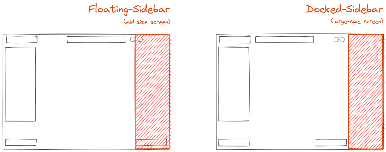
This prop indicates at what point should we break to a docked, permanent sidebar. If not passed it defaults to [`MQ_RIGHT_SIDEBAR_MAX_WIDTH_PORTRAIT`](https://github.com/excalidraw/excalidraw/blob/master/src/constants.ts#L167). If the `width` of the `excalidraw` container exceeds `dockedSidebarBreakpoint`, the sidebar will be dockable. If user choses to dock the sidebar, it will push the right part of the UI towards the left, making space for the sidebar as shown below.
#### `exportOpts`
The below attributes can be set in `UIOptions.canvasActions.export` to customize the export dialog. If `UIOptions.canvasActions.export` is `false` the export button will not be rendered.
| Attribute | Type | Default | Description |
| --- | --- | --- | --- |
| `saveFileToDisk` | boolean | true | Implies if save file to disk button should be shown |
| `onExportToBackend` | <pre> (exportedElements: readonly NonDeletedExcalidrawElement[],appState: AppState,canvas: HTMLCanvasElement | null) => void </pre> | | This callback is triggered when the shareable-link button is clicked in the export dialog. The link button will only be shown if this callback is passed. |
| `renderCustomUI` | <pre> (exportedElements: readonly NonDeletedExcalidrawElement[],appState: AppState,canvas: HTMLCanvasElement | null) => void </pre> | | This callback should be supplied if you want to render custom UI in the export dialog. |
#### `onPaste`
This callback is triggered if passed when something is pasted into the scene. You can use this callback in case you want to do something additional when the paste event occurs.
<pre>
(data: <a href="https://github.com/excalidraw/excalidraw/blob/master/src/clipboard.ts#L21">ClipboardData</a>, event: ClipboardEvent | null) => boolean
</pre>
This callback must return a `boolean` value or a [promise](https://developer.mozilla.org/en-US/docs/Web/JavaScript/Reference/Global_Objects/Promise/Promise) which resolves to a boolean value.
In case you want to prevent the excalidraw paste action you must return `false`, it will stop the native excalidraw clipboard management flow (nothing will be pasted into the scene).
#### `importLibrary`
Imports library from given URL. You should call this on `hashchange`, passing the `addLibrary` value if you detect it as shown below. Optionally pass a CSRF `token` to skip prompting during installation (retrievable via `token` key from the url coming from [https://libraries.excalidraw.com](https://libraries.excalidraw.com/)).
```js
useEffect(() => {
const onHashChange = () => {
const hash = new URLSearchParams(window.location.hash.slice(1));
const libraryUrl = hash.get("addLibrary");
if (libraryUrl) {
excalidrawRef.current.importLibrary(libraryUrl, hash.get("token"));
}
};
window.addEventListener("hashchange", onHashChange, false);
return () => {
window.removeEventListener("hashchange", onHashChange);
};
}, []);
```
Try out the [Demo](#Demo) to see it in action.
#### `setToast`
This API can be used to show the toast with custom message.
<pre>
({ message: string,
closable?:boo