@aliretail/react-materials-components
Version:
239 lines (201 loc) • 11 kB
Markdown
---
title: FormComponents-API
order: 1
category: UI
description: FormComponents 组件描述
screenshot: https://gw.alicdn.com/imgextra/i2/O1CN01yW3hCD1M8CnqeKFlq_!!6000000001389-2-tps-90-90.png
---
# 零售云动态表单控件集合
--------------------
## Badges
[![Build status][build-status-image]][aone-ci-url]
[![Line coverage][line-coverage-image]][aone-ci-url]
[![Branch coverage][branch-coverage-image]][aone-ci-url]
[![TNPM version][tnpm-image]][tnpm-url]
[![TNPM downloads][tnpm-downloads-image]][tnpm-url]
--------------------
## 用途
基于 [FormilyJS](https://formilyjs.org/) 的元件集合,已将基础组件适配财鲸样式并内置常用业务组件,详细可参考 `内置组件列表` 一项,
当 Formily 不熟悉可先参考 FormilyJS 文档进行学习
## 内置组件列表
推荐:通过 setup 方法注册组件到 FormilyJS 中,setup 同时支持传入一个自定义componentMap,可以对组件注册表做别名映射。
**为了避免开发调试时组件和页面使用的formily/next版本不同导致无法使用自定义注册的表单组件,组件会同时export formily/next的所有方法,可以直接使用**
```typescript
import { FormComponents } from '@aliretail/react-materials-components';
const {
setup,
SchemaForm,
SchemaMarkupField: Field,
FormButtonGroup,
Submit,
} = FormComponents;
// 注册内置元件
setup();
export default () => {
return (
<SchemaForm>
<Field type="input" title="Input" name="input" />
</SchemaForm>
);
}
```
> 通过 setup 后,会内置下列常见字段,并注册对应的 Form 展示体验
| type 类型 | 对应组件 | 描述 |
| :---------------- | :----------------------------------------------------------- | :------------------ |
| input | [Input](https://fusion.design/59356/component/input?themeid=15665) | 输入框组件 |
| textArea | [Input.TextArea](https://fusion.design/59356/component/input?themeid=15665) | 文本框组件 |
| select | [Select](https://fusion.design/59356/component/select?themeid=15665) | 选择器 |
| numberPicker | [NumberPicker](https://fusion.design/59356/component/number-picker?themeid=15665) | 数字输入框 |
| RangeNumberPicker | [NumberPicker](https://fusion.design/59356/component/number-picker?themeid=15665) | 数字输入框 |
| switch | [Switch](https://fusion.design/59356/component/switch?themeid=15665) | 开关组件 |
| datePicker | [DatePicker](https://fusion.design/59356/component/date-picker?themeid=15665) | 日期选择器 |
| rangeDatePicker | [DatePicker.RangePicker](https://fusion.design/59356/component/date-picker?themeid=15665) | 日期区间选择 |
| weekDatePicker | [DatePicker.WeekPicker](https://fusion.design/59356/component/date-picker?themeid=15665) | 周选择 |
| monthDatePicker | [DatePicker.MonthPicker](https://fusion.design/59356/component/date-picker?themeid=15665) | 月选择 |
| yearDatePicker | [DatePicker.YearPicker](https://fusion.design/59356/component/date-picker?themeid=15665) | 年选择 |
| range | [Range](https://fusion.design/59356/component/range?themeid=15665) | 区段选择器 |
| upload | [Upload](https://fusion.design/59356/component/upload?themeid=15665) | 上传组件 |
| checkbox | [Checkbox](https://fusion.design/59356/component/checkbox?themeid=15665) | 复选按钮 |
| checkboxGroup | [Checkbox.Group](https://fusion.design/59356/component/checkbox?themeid=15665) | 复选按钮组 |
| radioGroup | [Radio.Group](https://fusion.design/59356/component/radio?themeid=15665) | 单选框组 |
| rating | [Rating](https://fusion.design/59356/component/rating?themeid=15665) | 评分 |
| transfer | [Transfer](https://fusion.design/59356/component/transfer?themeid=15665) | 穿梭框 |
| checkedAll | [WhaleCheckedAll](https://fusion.design/59356/biz/1113?themeid=15665) | 快捷全选复选框 |
| unstableFormStep | [FormStep](https://formilyjs.org/#/zoi8i0/MAUJU4SyFj) | Formily 组件库 |
| cascaderSelect | [CascaderSelect](https://fusion.design/59356/component/cascader-select?themeid=15665) | 级联选择 |
### Field 拓展属性
| 拓展字段 | 类型 | 默认值 | 备注 |
| :--------------------------------- | :------------------- | :-------- | :----------------------------------------------------------- |
| disabled | `boolean` | false | 对应组件 disabled |
| 'x-component-props'.readOnlyRender | (props) => ReactNode | | 用于覆盖默认的预览状态 |
#### retail-form-item-props
| 拓展字段 | 类型 | 默认值 | 备注 |
| :--------------------------------- | :------------------- | :-------- | :----------------------------------------------------------- |
| explanation | `string`,`ReactNode` | undefined | 显示帮助信息 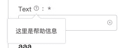 |
| explanationBallonProps | `BalloonProps` | undefined | 用于覆盖默认的配置 |
| emphasizeExplanation | `boolean` | false | 是否启用帮助文案部分展示方法 |
| showTipsExpand | `boolean` | false | 是否在部分展示的时候显示额外的 Balloon |
| addonTextAfter | `string` | '' | 输入内容后面带的文字 |
| inputAreaWidth | 'l' / 's' / number / string | 'l' | 自定义form item的宽度 l为正常长度 s为一半 其余值直接设置装内容的容器 |
| inputAreaWidthFixed | boolean | false | 是否固定form item宽度,在所有状态(编辑只读等)都强设置宽度 |
> *readOnlyRender 不支持 ArrayTable、Card、ErrorModal、GridLayout、Page*
### GridLayout 拓展属性
| 拓展字段 | 类型 | 默认值 | 备注 |
| :--------------------------------- | :------------------- | :-------- | :----------------------------------------------------------- |
| isForm | `boolean` | false | 当设置为form模式,则实际支持参数对照form布局组件;反之对照filter布局组件|
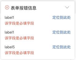
### ErrorModal
> *用于长表单显示表单错误, 使用参考 Demo,接收 className 和 style 微调样式*
| 字段 | 类型 | 默认值 | 备注 |
| :----- | :---------------------------------------- | :----- | :--------------------------- |
| id | 传入 SchemaForm 传入的 id,用于限定作用域 | null | |
| onJump | (elementId, element) => void | null | 表单字段ID是 Formily 的 path |
### ChildContainer
> *用于子容器的包裹容器,附加 effect 用于快速切换显示状态,具体请参照 demo*
#### effectChildDisplay(params: EffectChildDisplayProps)
```typescript
interface EffectChildDisplayProps {
parent: string;
child: string;
condition: (value: any) => boolean;
}
```
## types
#### IRetailSchema
> 这里是 Field 的字段的全量罗列,同时可在项目中通过代码引用
```typescript
import { FormComponents } from '@aliretail/react-materials-components';
const {
IRetailSchema
} = FormComponents;
```
```typescript
interface IRetailSchema {
/** 额外拓展属性 **/
itemStyle: React.CSSProperties,
itemClassName: string;
colSpan?: number | string;
rowSpan?: number;
disabled?: boolean;
['retail-form-item-props']?: IRetailFormItemProps;
/** base json schema spec**/
title?: React.ReactNode
description?: React.ReactNode
default?: any
readOnly?: boolean
writeOnly?: boolean
type?: 'string' | 'object' | 'array' | 'number' | string
enum?: Array<string | number | { label: React.ReactNode; value: any }>
const?: any
multipleOf?: number
maximum?: number
exclusiveMaximum?: number
minimum?: number
exclusiveMinimum?: number
maxLength?: number
minLength?: number
pattern?: string | RegExp
maxItems?: number
minItems?: number
uniqueItems?: boolean
maxProperties?: number
minProperties?: number
required?: string[] | boolean
format?: string
/** nested json schema spec **/
properties?: {
[key: string]: IRetailSchema
}
items?: IRetailSchema | IRetailSchema[]
additionalItems?: IRetailSchema
patternProperties?: {
[key: string]: IRetailSchema
}
additionalProperties?: IRetailSchema
/** extend json schema specs */
visible?: boolean //Field initial visible status(Whether the data is visible)
display?: boolean //Field initial display status(Whether the style is visible)
editable?: boolean
['x-props']?: { [name: string]: any }
['x-index']?: number
['x-rules']?: ValidatePatternRules
['x-component']?: string
['x-component-props']?: { [name: string]: any }
['x-render']?: <T = ISchemaFieldComponentProps>(
props: T & {
renderComponent: () => React.ReactElement
}
) => React.ReactElement
['x-effect']?: (
dispatch: (type: string, payload: any) => void,
option?: object
) => { [key: string]: any }
}
export interface IRetailFormItemProps {
emphasizeExplanation?: boolean;
explanation?: string | React.ReactNode;
explanationBallonProps?: BalloonProps;
extra?: string;
extraHighlight?: boolean;
showTipsExpand?: boolean;
// 输入内容后面带的文字
addonTextAfter?: string;
// 自定义form item的宽度
// l为正常长度 s为一半 其余值直接设置装内容的容器
inputAreaWidth?: 'l' | 's' | number | string;
// 是否固定form item宽度,在所有状态(编辑只读等)都强设置宽度
inputAreaWidthFixed: boolean;
}
```
## 组件规范
+ 支持value和onChange
+ 支持readOnly
+ 支持disabled
+ 支持className / style
+ 支持组件状态
+ error 或 state.error 实现错误展示样式
+ loading 或 state.loading 实现 loading 状态
+ warning 或 state.warning 实现 warning 状态
+ success 或 state.success 实现 success 状态
+ dataSource之类的支持异步数据源(可以考虑通过统一的hoc或者hook实现)
+ 组件自己不应实现 label 功能,此功能由 FormItem 实现